Packaging design process: a wine label
We recently designed the label for the white wine of the Japanese izakaya Yokaloka in Madrid. A small assignment different from what we usually do.
It may not be the most profitable work considering the amount of time it takes, but we love it when we're hired for these kinds of commissions related to branding or illustration because they take us out of the routine of typing and programming and challenge us to be extra creative with our proposals.
Spending a few days disconnecting and imagining how to 'dress up' a product to make it attractive and represent the brand's values in the best possible way is something we love. It's almost therapeutic.
In this article, we want to share a bit of the creative process we went through to design the label for this wine, as well as some of the initial sketches and mock-ups.
In this case, knowing the owners of the izakaya located in the Mercado de Antón Martín, we decided to go for something less conventional. We wanted a more personal label, full of Japanese symbolism, reflecting some of the owners' character, and with a hint of retro vibe.
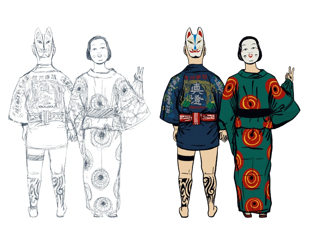
To achieve this, and starting from some photos of Yoka and Stephane, we created an illustration with a fairly relaxed pose, featuring kimonos, masks, tattoos…
This one with the tentacles was the first of the three proposals we made. Initially, we had discarded it ourselves because of its proximity to shunga iconography or Japanese erotic prints, and clear references to Hokusai's 'The Dream of the Fisherman's Wife'. We thought maybe they wouldn't find it appropriate, although we quite liked it ourselves.
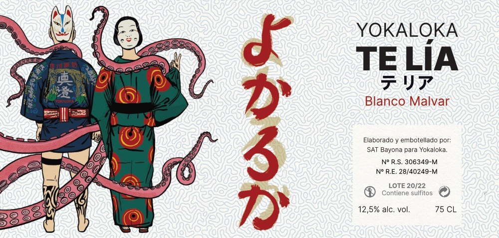
We also came up with playing with the names of the wines, as we hadn't discussed it during the briefing. In this first case, a double play with the octopus tentacles and the fact that the wine was aged on lees. Yes, a bit far-fetched. Not surprisingly, none of the proposed names made the cut... 😅
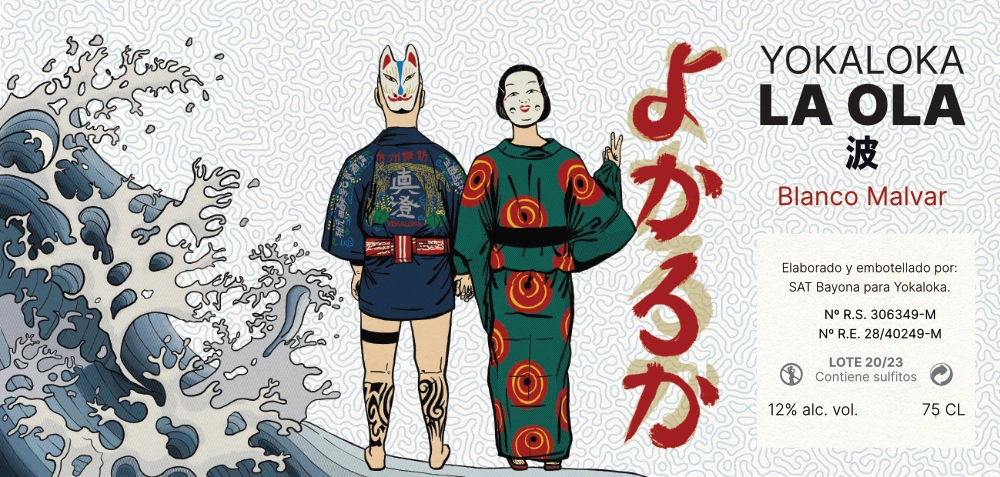
The second one was a variation of the first but playing with the idea of Hokusai's wave (second time present) and the sea, which we initially thought paired well with the product. In the end, the result was something more common, less integrated, and original. But we like to present our clients with different mock-ups and variations to explore and try different paths.
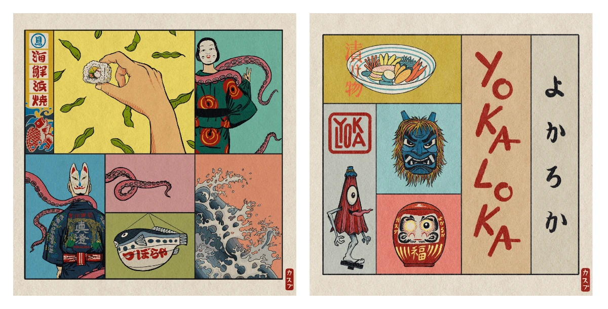
And the third, my personal favorite, presenting different elements linked to the wine in a bento box format. Although perhaps too risky for a wine, this somewhat Chris Ware-esque format (if I may dare) I think would fit perfectly applied to a craft beer:
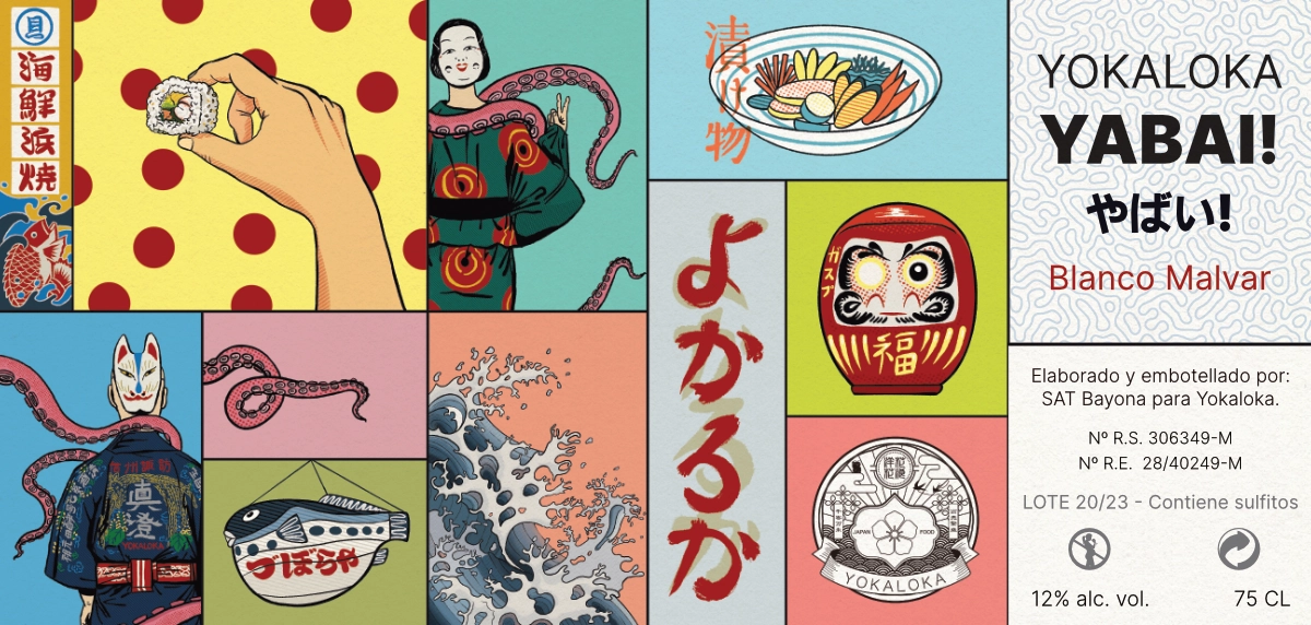
And we also quite liked the name of this one. It's a Japanese slang that young people use to describe anything from terrible to incredibly cool or even a bit wild. Yabai! sounds like a war cry and a statement of intent. In that regard, perhaps it would be a more suitable name for a red wine.
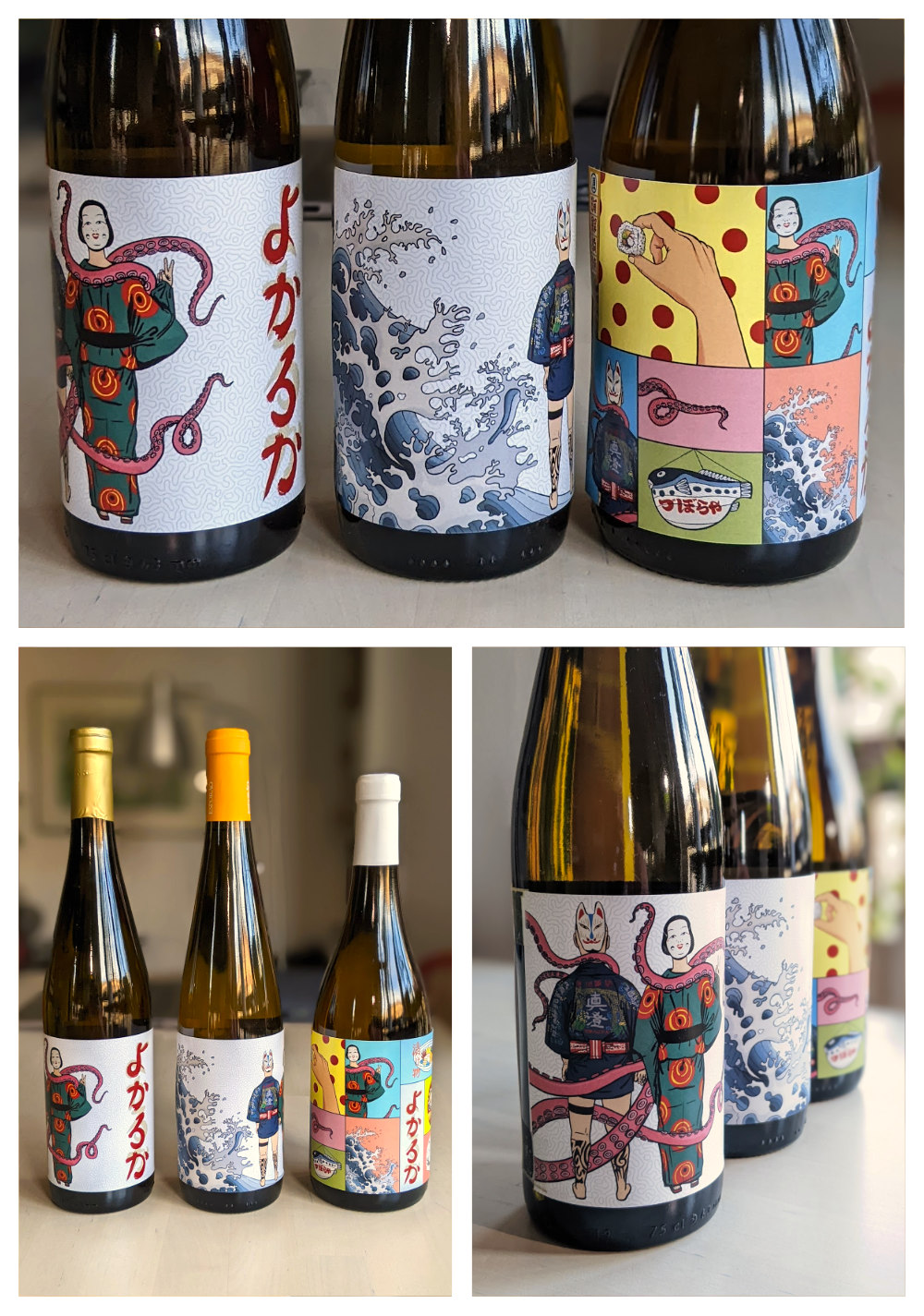
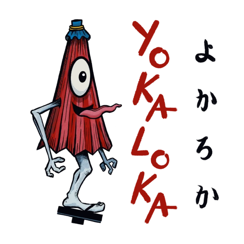
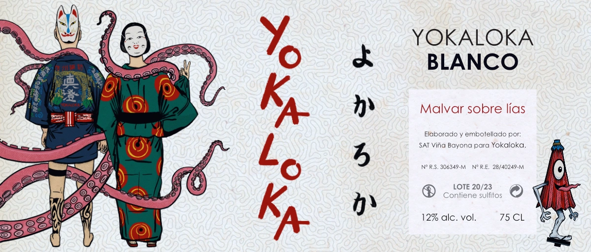
In the end, the first option we designed was selected, which often happens. For the final version, some edits were made to the initial mock-up, such as labeling in Spanish and hiragana, the final name of the wine which remained as "Yokaloka Blanco," as well as applying an aged effect to reinforce the vintage look of the label, which we weren't quite convinced about in the end. We also added the yōkai kasa-obake (傘おばけ: umbrella ghost) suggested by Yoka herself, which illustrates this article:
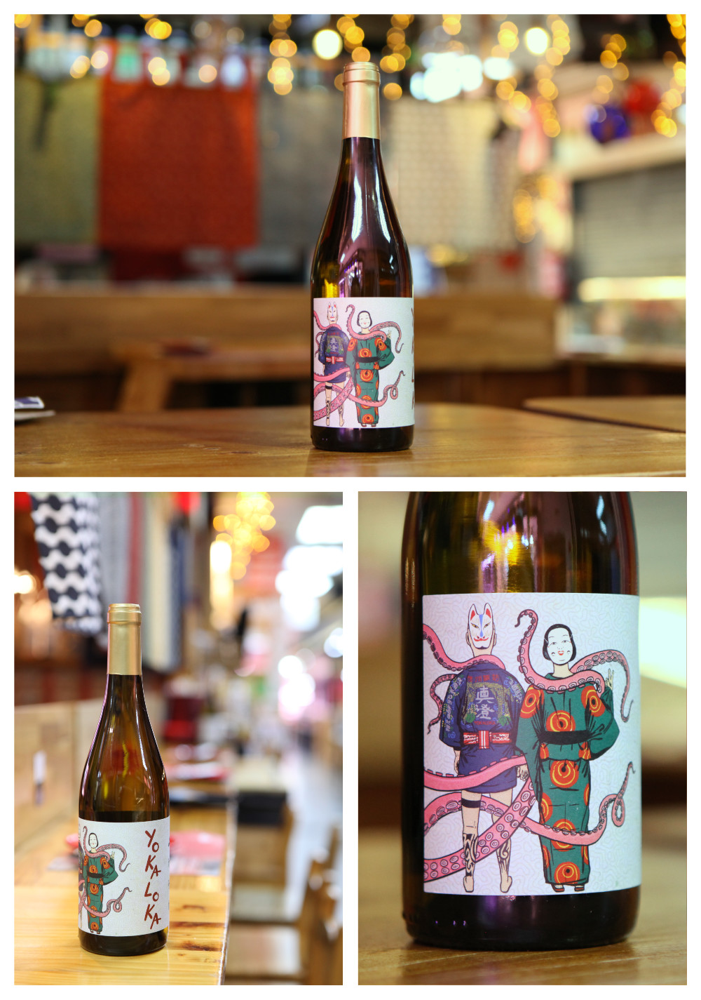
In conclusion, a project that we've enjoyed, had fun with, and furthermore, for one of our favorite restaurants in Madrid. You can't ask for more.
Well, maybe some slightly better photos, but the day I went to take them, I was incubating a mega-intestinal virus, and that's how they turned out... I'm sorry, but at least you get to see the label in action.
And as a bonus, a couple more bentos, which would make fantastic coasters (wink-wink), with some of the illustrations we created during the label design process:
If you liked the result and want a different packaging for your products, get in touch with us.